

SOUND BATH
Music Festival
This project aimed to create promotional materials for Pitchfork's annual music festival. This included posters, wayfinding, wristbands, a map, and more.
The Concept
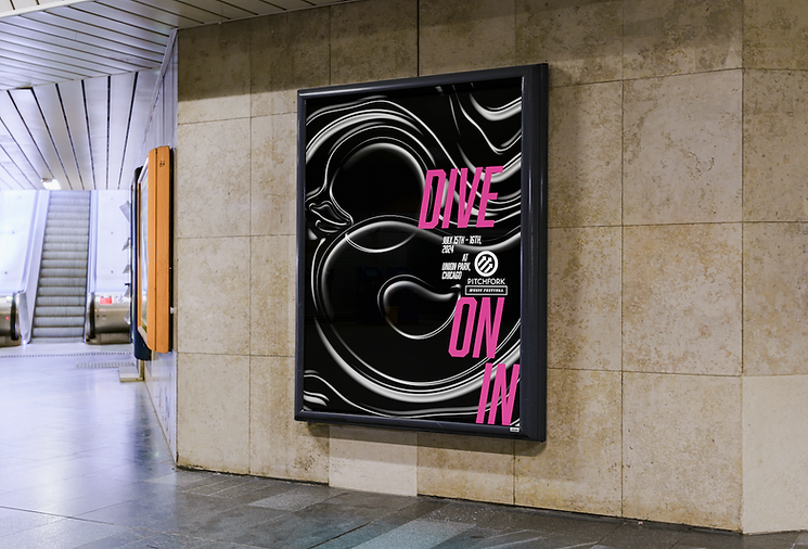
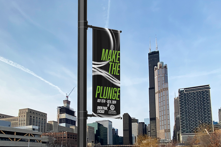
The initial inspiration for the design concept "Sound Bath" was the practice itself. A sound bath is an immersive, therapeutic meditation guided through the auditory senses. The rubber duck imagery was directly inspired by the annual Chicago Ducky Derby, in which over 60,000 yellow rubber ducks race down the Chicago River in a fundraising event for Special Olympics Illinois. Rendered bubbles cumulate to form silhouettes of these rubber ducks. Taglines "take a dip," "make the plunge," and "dive on in" continue across promotional applications.

a splash heard around the city
While the graphic elements are limited to black and white, the typography is bright and colorful. The white gestural strokes allude to the trail of light flashlights create when they move in the crowd.

For wristbands, black is all-access for artists, dark grey is Plus, and pale grey is general admission. The yellow type translates to access for Friday, green for Saturday, and pink for Sunday. Security can see each individual's access through these two sets of color organization.


the bath begins
The tagline "Let the sound bath begin" welcomes the festivalgoers to the venue. It opens the immersive experience and provides a photo opportunity for attendees.
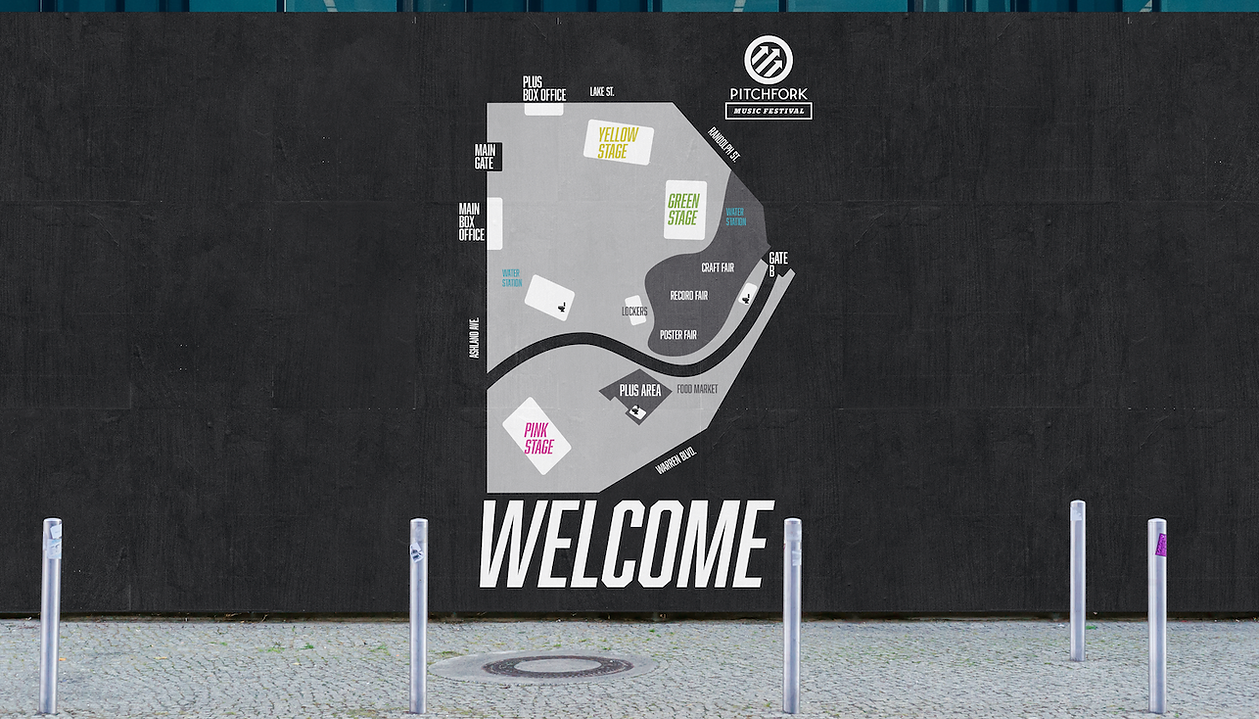
lead the way
The bubbles are further abstracted to imply movement and direction in wayfinding applications. Color-coded signage outlines the way to the yellow, green, or pink stages and the estimated walking time.
